
Power Solutions and Services


$200
A customizable powerapps component to be used in canvas apps for displaying a multicolumn grid. It makes use of nested galleries to display a nice looking grid for your needs
A fully customizable Multipurpose Powerapps Grid Component for displaying various types of data. It allows color, font size and other customizations and allows you to choose number of columns. It also allows you to choose row height and a custom loading spinner to enable a better user exxperience.
Please check out in the ‘Test Drive’ tab using the following credentials:
Username:
testuser@powersolutions.services
Password:
Testing_123
- Responsive
- Adjustable number of columns
- Adjustable width, height, X, Y of Title, Subtitle and Image
- Adjustable row height
- Supports URL for the Image element in each item of the grid. The URL can be replaced with “Appress” URL of any image that is uploaded in powerapps studio as well.
- OnItemSelect property for returning the current item selected:
- SelectedRecordID — For returning the ID of the selected item
- SelectedRecordTitle — For returning the Title of the selected item
- SelectedRecordSubtitle — For returning the Subtitle of the selected item
- SelectedRecordImage — For returning the URL of the selected Image
The component creates a few collections which are so uniquely named that it is almost impossible to be in conflict by chance. However, it is recommended not to use these collection names in your app to avoid any potential conflict.
- c_DynamicGridComponent_ColorConfiguration – For storing user color preferences
- c_DynamicGridComponent_CollectionForDisplay_AddRowNumbers – For internal row generation mechanism of the component
- c_DynamicGridComponent_CollectionForDisplay_Step2 -For internal data population of the component.
Rest assured that the above will be automatically cleaned within the loading time of the component.
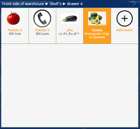
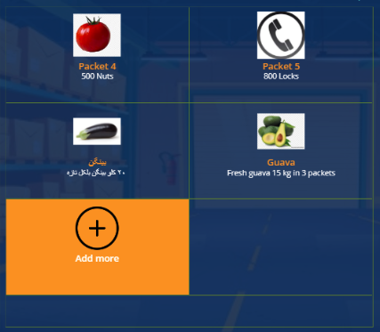
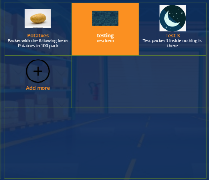
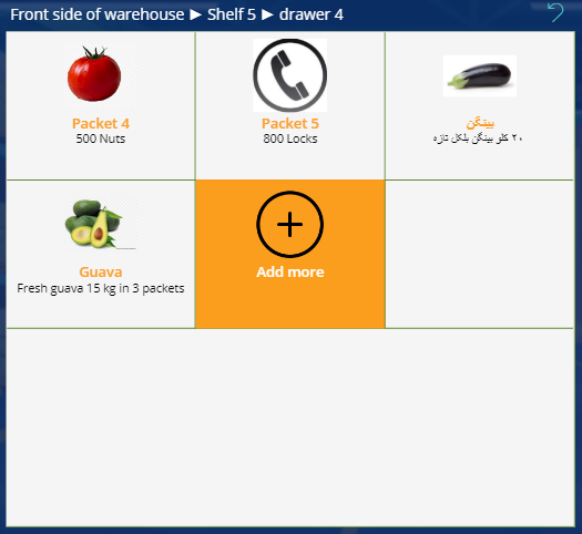
- To display products / shelves /bins in a warehouse management app
- To make a fully customized calendar view
- To Display library section and/or books in a library management app
About Us
 We are a team of business professionals with a keen interest in low-code technologies.